Polishing Pitivi's ruler
In Pitivi, the ruler is displayed above the timeline to show the times corresponding with the current view. A series of H:MM:SS.XXX timestamps on a ruler might leave the impression that only trained professionals are supposed to use it. I had trouble reading the timestamps and looked for ways to make the ruler more useful. Read below for the story.

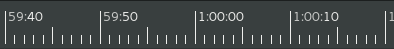
Pitivi ruler, Dec 2013
Relevant parts
Around the New Year 2013-2014 I thought about highlighting the relevant parts in the timestamp. For example, if you have 0:00:05.000 and then 0:00:10.000, you have to look quite a bit until you notice what changes from one to the other. In this case the “10” should be highlighted because that’s different than the previous timestamp. This way it’s easier to see what an interval represents. Jeff liked the idea and the commit went in.
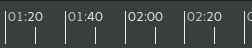
The ruler being more useful, I started to look more at it while using Pitivi. One week later, after 6 code cleanup commits, the millis were being displayed with a smaller font, so they can be ignored more easily. One hour later though, the hours and millis were being displayed only when useful:
- The hour is displayed only if greater than 0.
- The millis are displayed only when the zoom level is high enough that millis other than “.000” start to show up in the timestamps. This got improved later!
The shorter timestamps looked good so the changes went in.
Guessing most projects are less than one hour long and most of the time users don’t use zoom levels where milliseconds matter—this was already a big improvement, it’s much easier to see “MM:SS” than “0:MM:SS.000”.
Pitivi ruler zoomed out, Jan 2014
Dividing an interval
An “interval” on the ruler is the interval at which the timestamps are shown. At different zoom levels, the length of the interval is picked automatically out of a hardcoded list, so you see an optimum number of timestamps. It was awkward that the displayed intervals were always divided in 10 parts. While it makes sense for a 10 seconds interval to be divided by 10, it’s not very useful when a 30 minutes interval is divided by 10.
It was easy to define the tick frequency for each of the hardcoded intervals, but it looked awkward for most of the zoom levels. Previously we clearly preferred largish interval sizes (so the interval can be divided in 10 smaller but still visible units) but it was not so nice anymore when a large interval is divided only in 2 units. Some fine-tune of the minimum interval length and the minimum division length was required. The smaller timestamps fit great with the smaller intervals:
Dividing by 2 is enough for some intervals, Dec 2015
Timestamp shape
While fine-tuning the minimum interval and interval division size, I realized that when displaying millis, it’s useful to display only the millis, except for the full second timestamps when only [H:]MM:SS is displayed. This way it’s much easier to see where the full seconds are, because “00:01” looks quite different shape-wise than “.500” which is displayed with a smaller font. Luckily, by keeping all the timestamps short (".900" is the shortest and “9:00:00” is the longest), it was possible to have a simple formula for choosing the optimum interval per zoom level.
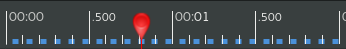
Pitivi ruler zoomed in, Jan 2016
The commit went in, along with a cherry.
Some did not like the pear-shaped playhead though, so we later replaced it with an empty diamond.
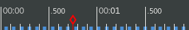
Pitivi playhead, Apr 2016
Start Pitivi and look at the ruler, zooming in and out, a nice feeling starts bubbling up inside.
Until we wrap up 0.96, you can already see the ruler in action by downloading the Pitivi bundle! BTW, the bundle already includes the proxy files functionality which allows using any video format reliably. Read: no more artifacts when using MTS files. When compared, the ruler polishing I described above is just me playing in the sand. The proxy files functionality brings Pitivi much closer to 1.0. Please try it out and tell us how it works for you! :)
If you are still here, see maybe the entire history of Pitivi’s ruler.
